Field Notes / Design
Reducing the design noise
Kinetic 2.0 had plenty of personality. Kinetic Editorial kept the energy and gave the page a reading order.
Concept iteration documented · not a public before-and-after or conversion result
The Kinetic 2.0 exploration had energy. It also had a wordmark, a yellow hero, two calls to action, project imagery, color blocks, oversized headlines, and diagrams all trying to introduce themselves at once. A perfectly nice party. A fairly exhausting website.
Direction comparison
Keep the energy. Give it an order.
A public-safe explanatory excerpt and a later composition study show the edit. Neither is a screenshot of a released website.
The useful energy source, recreated as a safe hero-only excerpt. It is not the original board; fictional portfolio and placeholder-results sections were deliberately left out.
Open full-size excerpt (1961 × 802)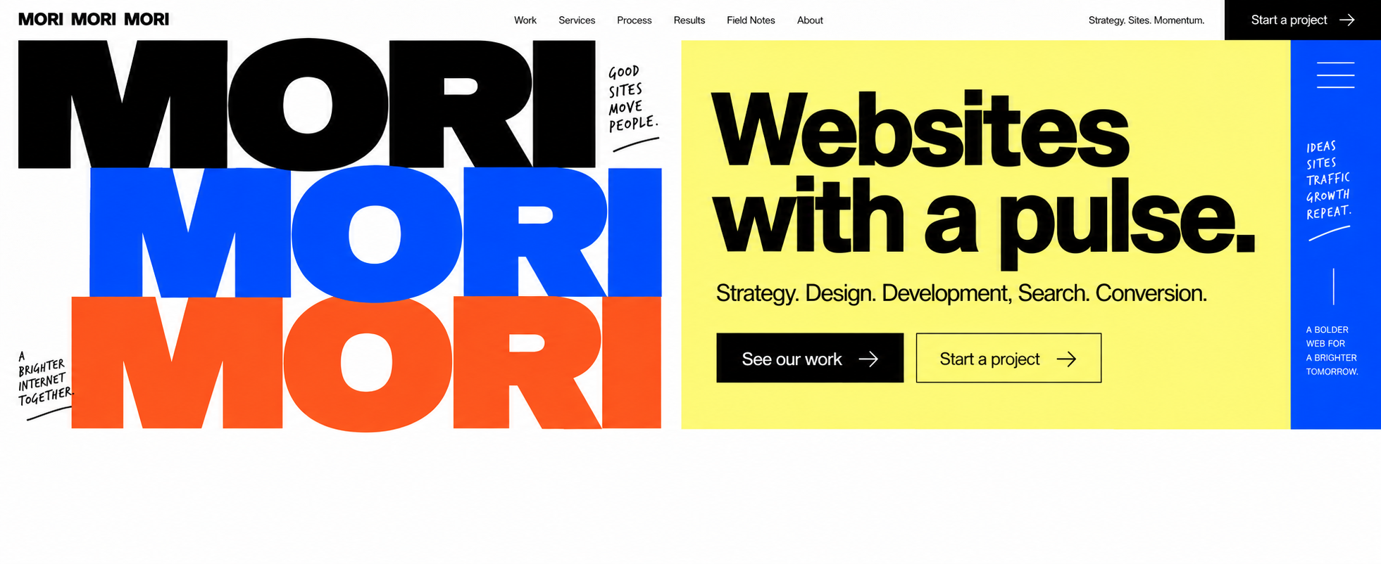
Three things to notice
- ColorEarlier
Yellow, blue, and orange all arrive at full volume.
RefinementOff-white carries the page; color marks emphasis and the close.
- TypeEarlier
The wordmark and hero headline compete as two giant openings.
RefinementOne expressive wordmark leads; the rest becomes a readable editorial sequence.
- Reading orderEarlier
Two hero actions and several panels ask for attention at once.
RefinementOne action leads into work, process, services, and a final invitation.
The process, in four moves
- ExploreBuild Kinetic 2.0 as a high-energy flagship composition.
- NoticeIdentify the hero actions, color fields, and blocks competing for attention.
- EditUse Kinetic Editorial to create one opening and a readable sequence.
- CarryKeep the hierarchy rule available for later prototypes and releases.
The problem was equal volume
Each piece worked well enough on its own. The trouble appeared when they shared a page. Everything had been given nearly the same visual importance, so the page never told you what mattered most. Making every section memorable had made the sequence harder to remember.
The correction in the design brief was simple: kinetic energy is the signature, not the layout system. Keep one loud moment. Give the rest of the page a job. Kinetic Editorial was the structural pass that tested that rule without sanding off the identity.
Three edits did most of the work
First, the hero moved from two competing actions to one primary invitation. Second, the off-white field gave the wordmark and promise room to lead; blue, orange, and yellow stopped behaving like three simultaneous announcements. Third, the page became a sequence: introduction, named work, process, services, then invitation.
That did not make the refined concept decoration-free. Its closing banner still uses a colorful wordmark and a handwritten interruption. The difference is hierarchy. A special moment can stay special when every other block is not making the same demand.
A comparison needs honest labels
The earlier visual is a generated, public-safe hero excerpt based on the September 28 Kinetic 2.0 board. It is not the original board; the fictional portfolio and placeholder-results sections were intentionally excluded. The later visual is the full Kinetic Editorial concept and uses real Christopher project names inside a generated presentation. Neither image is a historical screenshot of a public site, proof of client work, or evidence that a redesign improved visitor behavior.
The practical test was whether removing a rule, mark, or effect removed meaning. If it did not, it was a candidate for the cutting-room floor. Motion could help something arrive and settle instead of continuously requesting applause. This is design judgment, not a conversion experiment. The useful result is a clearer rule for making the next decision.
| Signal | Kinetic 2.0 | Kinetic Editorial |
|---|---|---|
| Opening | Wordmark, yellow hero, and two actions compete | Off-white field and one primary action |
| Color | Several full-weight panels | Accents are saved for emphasis and the close |
| Work | Illustrative sample imagery | Named Christopher projects in a consistent grid |
| Sequence | Multiple blocks ask to lead | Introduction, work, process, services, invitation |
Keep this part
Before adding personality, check whether the personality already there has room to breathe.
Bring the energy. We’ll help decide what should speak first.
Explore a website rethinkRecorded checks, with the limits attached
- The earlier visual is labeled as a generated public-safe excerpt, not the original September 28 board.
- The full earlier board’s fictional portfolio and placeholder-results areas are not published in this note.
- The later Kinetic Editorial image is an exact copy of the reviewed September 28 concept asset.
- No conversion lift, audience response, ranking result, client proof, or business outcome is claimed.
What this note is based on
Based on the studio’s September 2026 brand-system README, concept index, and design-direction brief. This records a design decision with a labeled explanatory excerpt, not a public before-and-after or measured visitor behavior.
Further reading: Website redesign services
Our results page explains the same evidence standard. For the studio’s approach, return to the MORI MORI MORI home page.